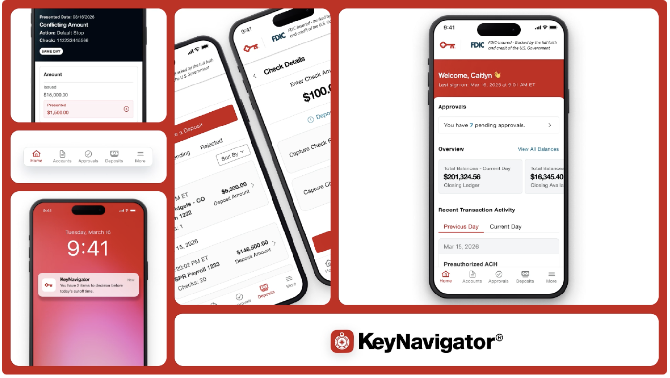
KeyNavigator Mobile
KeyBank’s existing mobile app wasn’t doing enough for its business clients. So, with Caitlyn Cielo, I helped design a totally new, zero-to-one experience that brought the detailed features from KeyNavigator Desktop into a mobile-friendly experience. We worked without requirements, building app designs from scratch that informed design. With this rapid-fire approach, we were able to deliver the app quickly - in just 11 months from the first kick-off to launch on the App Store.
Role
Senior UX Writer
Collaborators
Caitlyn Cielo, Lead Product Designer (Portfolio)
Background
Only 14% of business clients used the original app. KeyBank wasn’t serving its business clients on mobile.
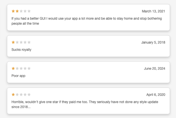
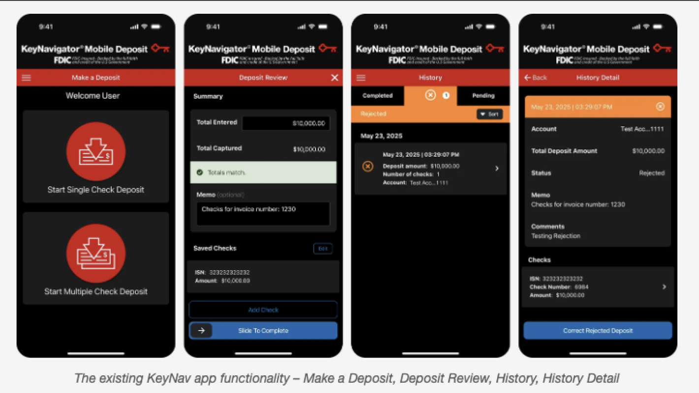
The existing app only had one feature: Remote Check Deposit. That’s not enough for today’s complicated businesses. And it was reflected in the app’s poor rating: 1.6 on the App Store.
Home Page
A business’s health at a glance.
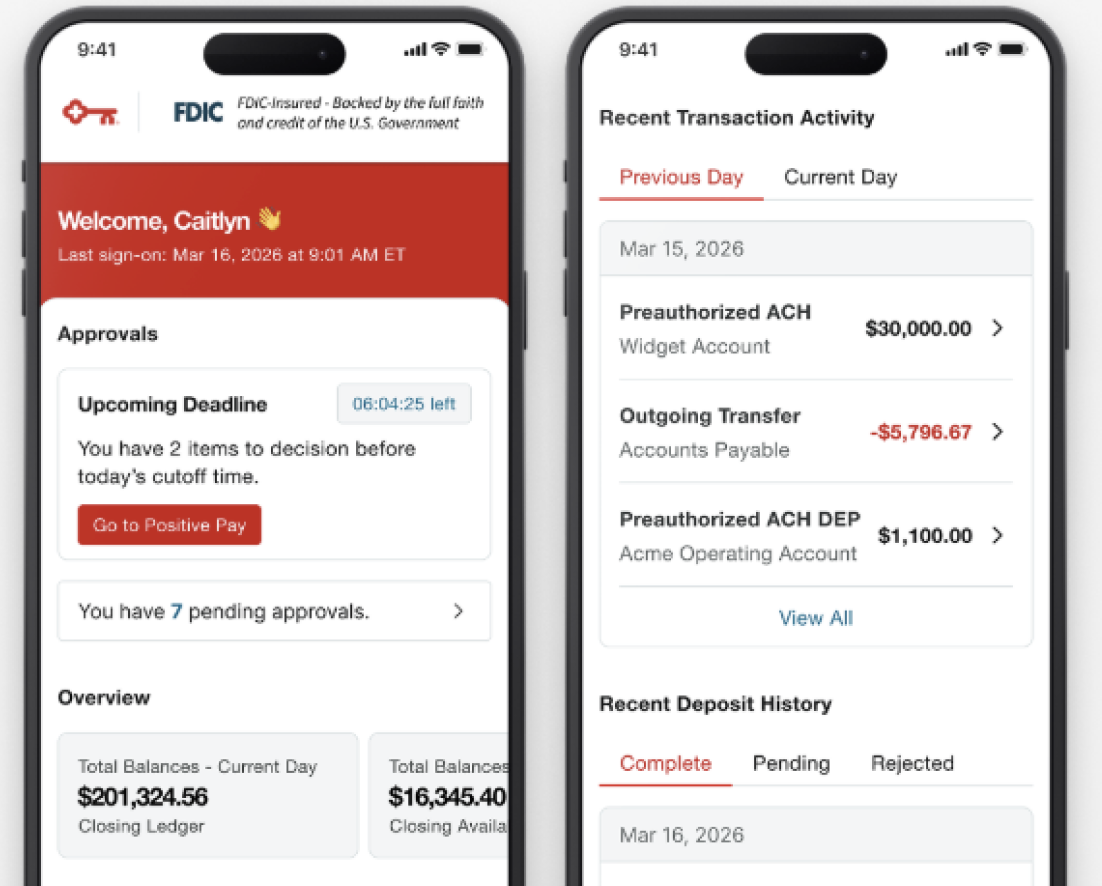
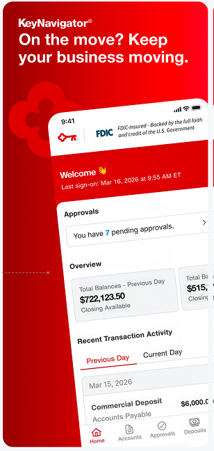
There’s a lot of information in KeyNavigator Desktop. Our main design question was how to take all of that information and make it understandable on a smaller screen. First, we designed for the most pertinent information - the home page starts with important upcoming deadlines for approvals, as well as a friendly greeting to the user.
Then, we emphasize the company’s real-time balances across all of its accounts and present the first few most recent transactions, with options for users to dive deeper into the data.
Global Navigation
Designing for multiple types of users.
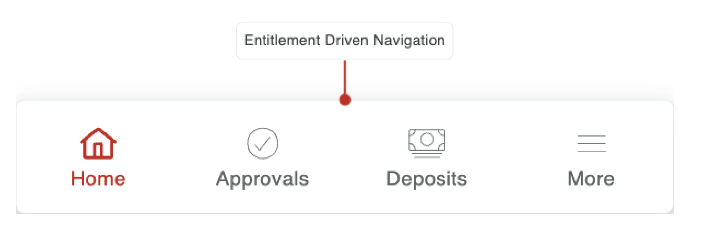
KeyNavigator has multiple kinds of user roles, which each have custom levels of access to the business. Supervisors can approve transactions, while basic users can send limited transactions based on their custom limits. As a result, not every user has access to the same features. So, how do we design an app that can be so highly customized?
First, we designed for the maximum case. This was a user who had access to everything from approvals to deposits to accounts. For users who had less access, the global navigation could reduce to as few as three tabs: Home, Deposits, and More. In this way, we made sure the app was useful for every user, no matter their status in the business.
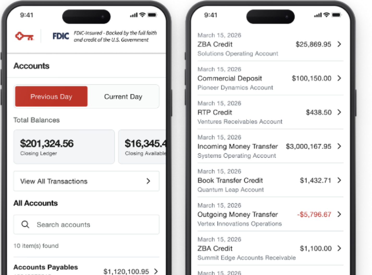
Distilling large amounts of information for mobile.
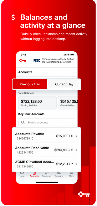
Business clients could have hundreds of accounts. To adapt this information for mobile and improve scan-ability, we placed the most important balances at the top, with the option to switch between real-time and posted balances, while giving the user a brief overview of transactions, which they could then dive into and filter using more detailed search terms.
Approvals
We adapted a complex approvals flow to mobile.
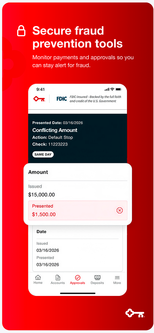
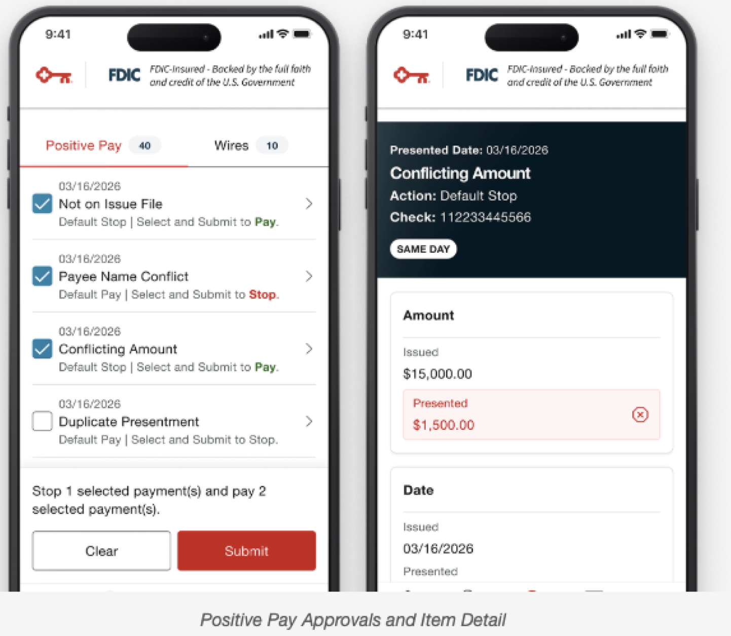
On desktop, users can approve and reject payments. Often these involved complex transactions like wire transfers. We distilled the most pertinent information into a compact list for mobile, and we also designed an item detail state that allowed users to dive deep into the information on each transaction if they wanted. As the writer, I made sure that the main approvals page had clear language telling the user what effects their action would take, as the Approvals page involved both rejecting and approving transactions.
App Store Listing Update
Accounts
Deposits
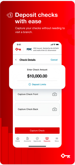
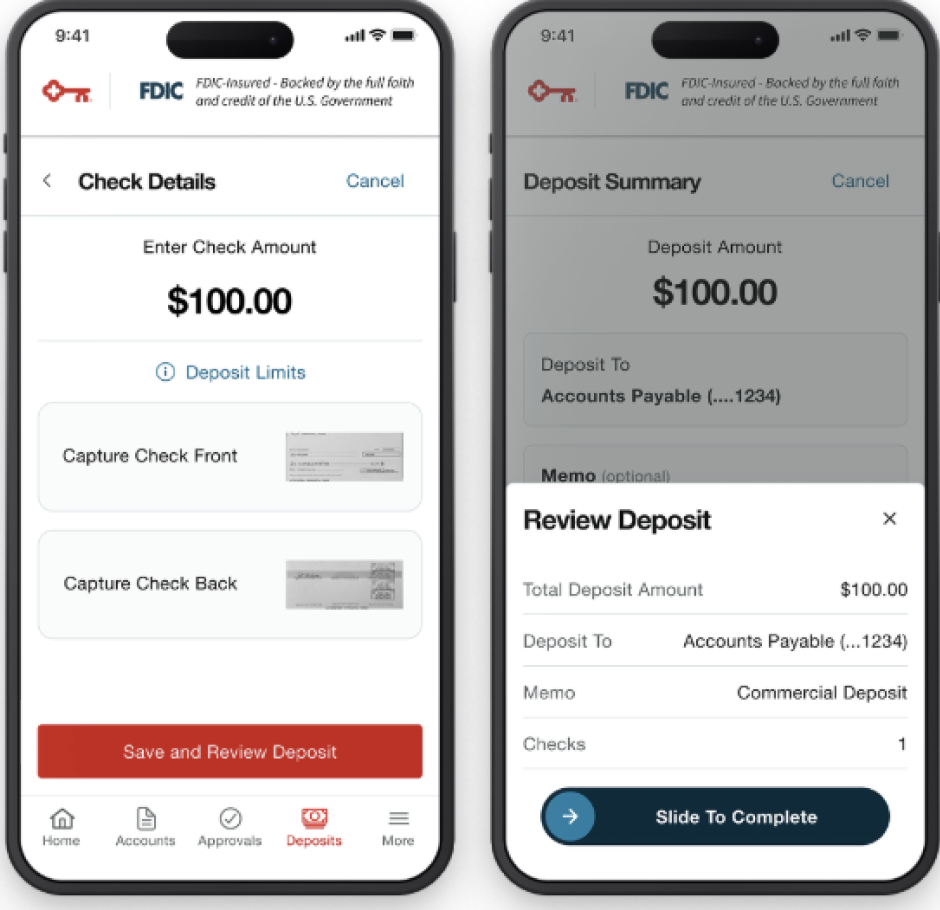
We modernized the existing deposit experience, bringing it up to our design system standards.
The new deposit experience allowed for both individual and multiple check deposits, while also including both light and dark mode. As the writer, I tackled issues like making sure the multiple check flow had clear instructions, as well as robust error messaging.
Notifications
Alerts let users bank on the go.
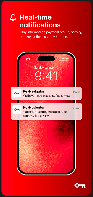
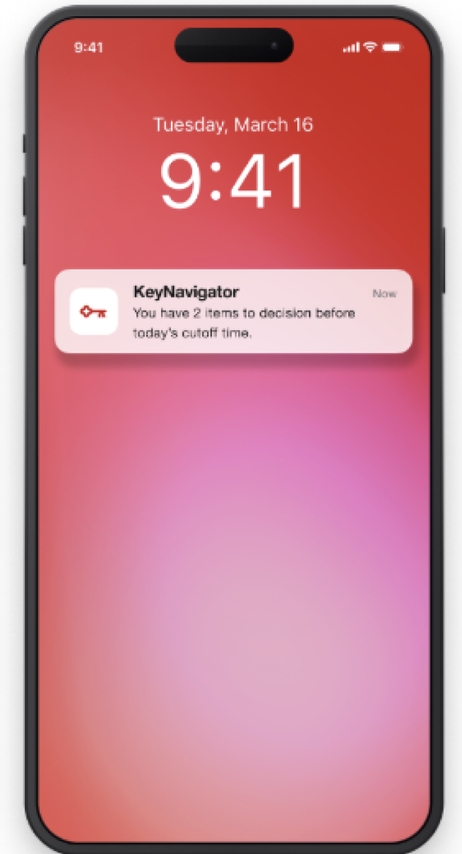
We made sure that the app had a table-stakes feature: push notifications. Users would get alerted about pending payments, permission requests, deadlines, and more. This brought us up to par with competitors and helped clients stay on top of their transactions.
Settings and More
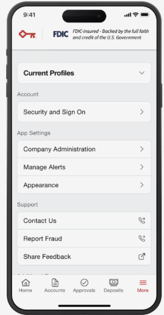
We brought desktop’s advanced setting suite to mobile.
Users could switch between company profiles that had different entitlement features. Users could also update permissions, alerts, and sign-on info. We also gave users more ways to contact us for support and feedback, allowing a more robust experience.

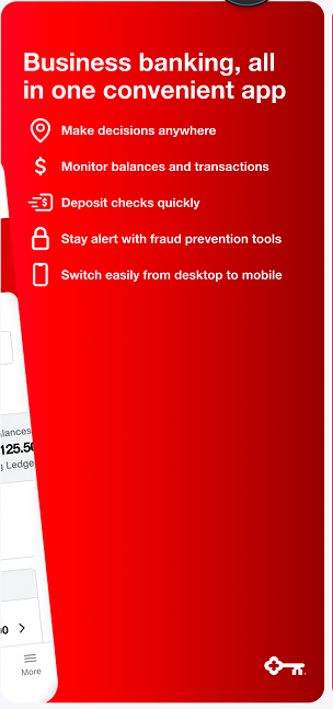
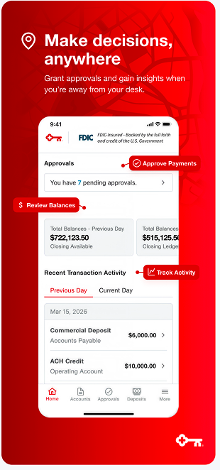
Finally, we made eye-catching designs for the app store.
We designed a new logo, simplified around the KeyNavigator compass logo, and I wrote headlines for each screenshot on the App Store, advertising the features debuting on the app. We also developed messaging in the old app to alert users to make the switch to the new and improved KeyNav Mobile.