tastytrade Application Redesign and Trader Tutorials
Tastytrade had an outdated application process, which needed an upgrade if they were going to position themselves as a cutting-edge platform for retail stock traders.
Additionally, they ran into a separate problem after users signed up. Many traders were opening accounts, but the platform was built for highly knowledgeable stock traders, which made it daunting for first-time traders. To help them start their trading journey, I worked with the experts on the Tastytrade Trade Desk to devise a tutorial site that taught users the ins and outs of advanced stock trading and how to navigate the platform.
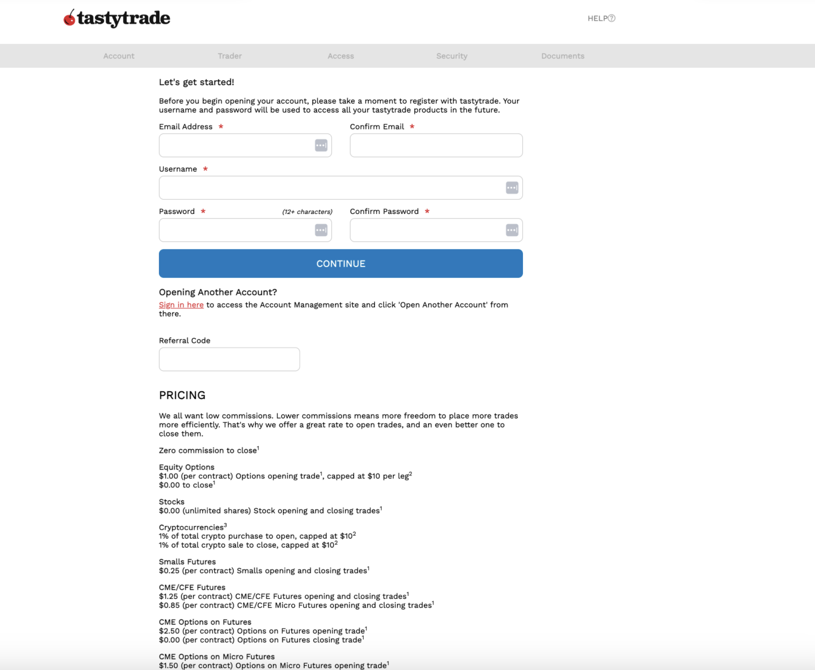
The initial application state was verbose and didn’t adhere to best UX practices. The first screen asked for login info, along with a long, irrelevant pricing list. The entire form was a single page, creating an arduous scrolling experience and included intrusive pop-ups. With a mess of bulleted lists, accordions, and checklists, the application didn’t have a consistent look and feel.
For a financial company, modern UX design and content can be an immediate way to establish trust with a user, which is critical to getting them to convert.
A confusing, daunting initial state
A new navigation hierarchy helped users get oriented
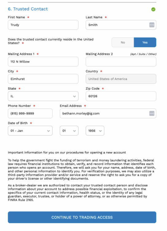
By adding a left-hand navigation, users could clearly see what sections were coming up next and also track their progress in the application. Additionally, we standardized components to align with the design system used within Tastytrade’s trading interface, so the application was a way to introduce users to our design language. The more consistent components also gave the application the feel of a modern fintech.
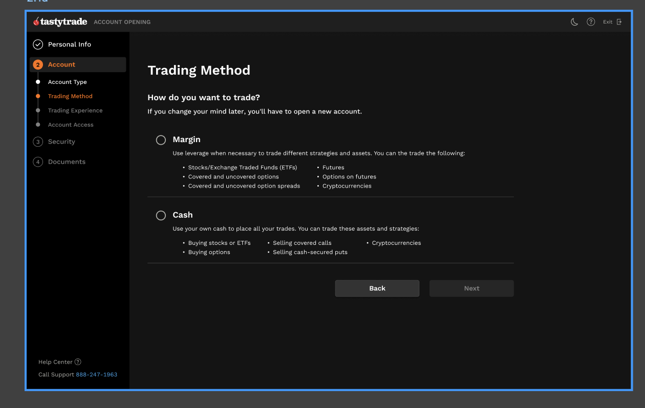
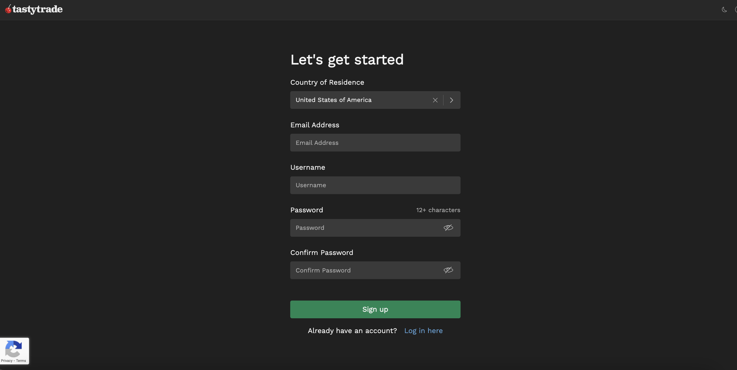
A new, more intuitive approach
After doing extensive competitor research, I broke down the application into clearer, more defined steps. Instead of presenting the users with all the fields upfront, I began with a simple sign up screen with the most pertinent fields first, including an option to login for users who mis-clicked.

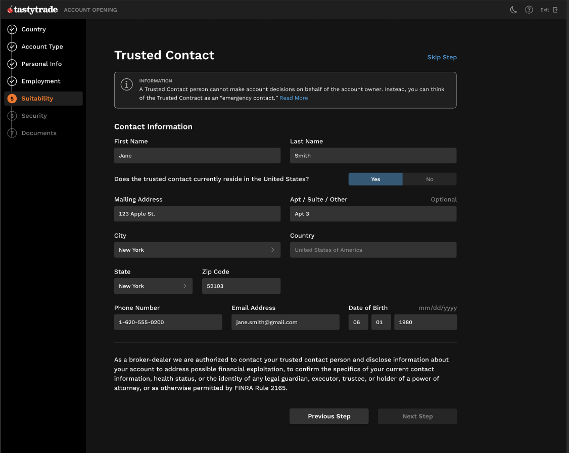
But every design has to consider legal regulations
In finance, it’s not enough just to make a clear user experience - you also have to pass through financial regulations. As the UX writer, I had to consider how we presented definitions around margin accounts and trusted contacts. While the original application had long-winded, legalese descriptions, I was able to talk about these features in everyday language, so everyone from new traders to seasoned veterans could understand.
Tutorial Courses
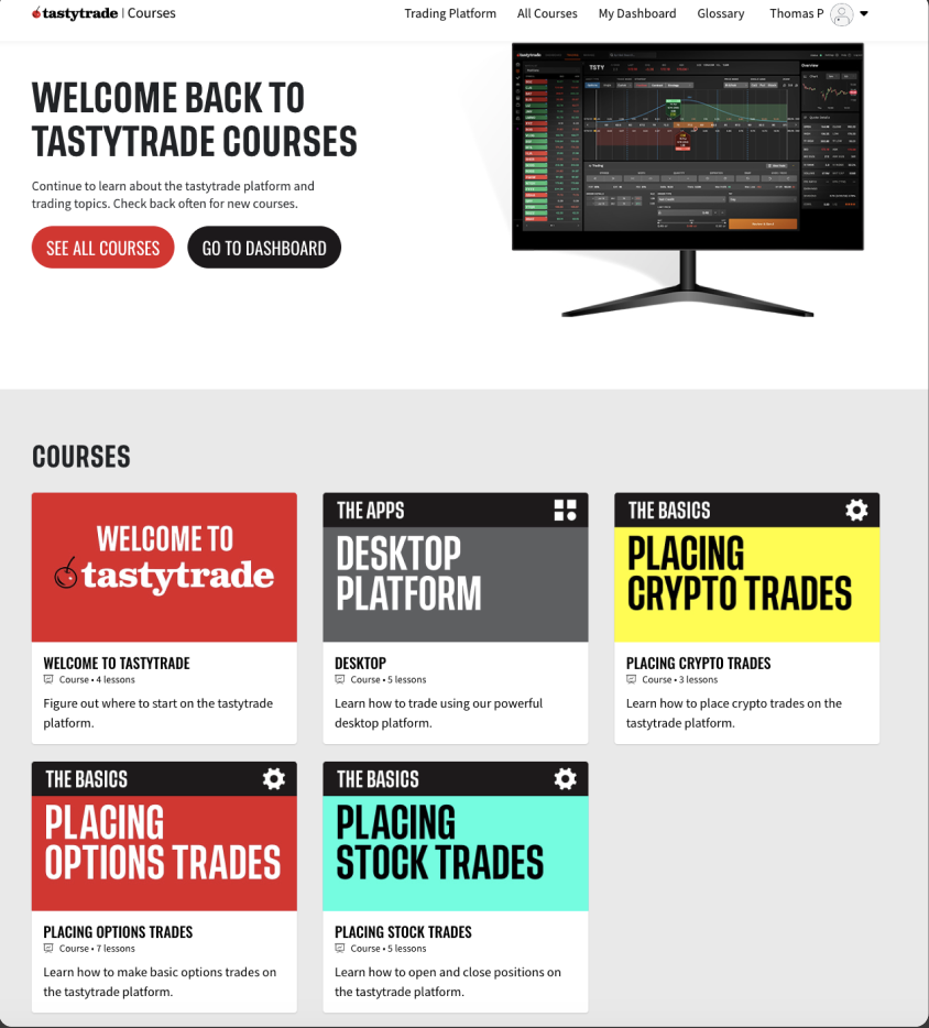
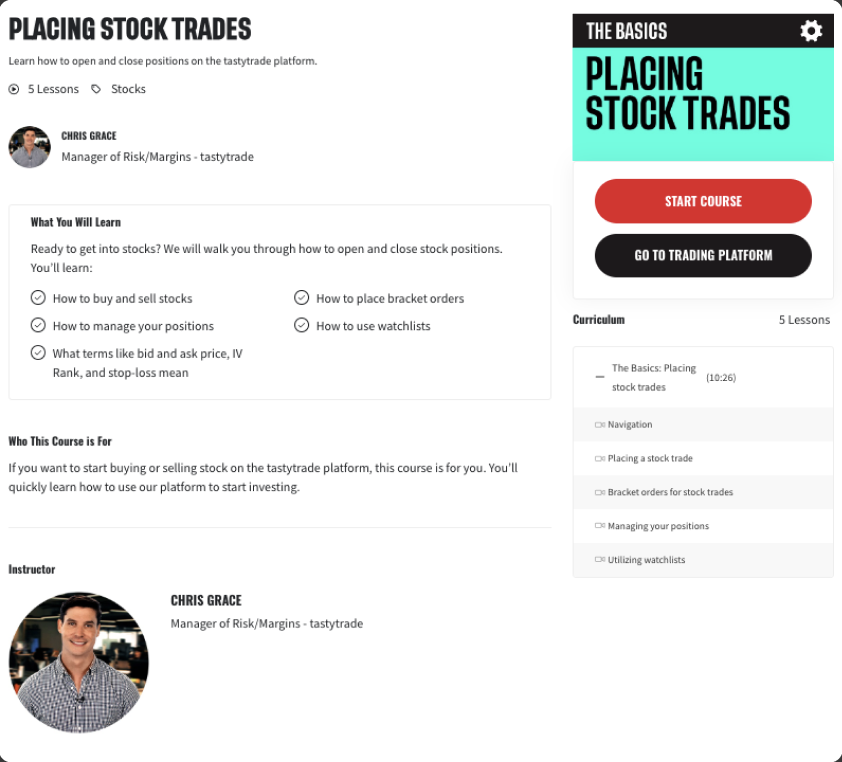
We’ve got them in the door! …Now what?
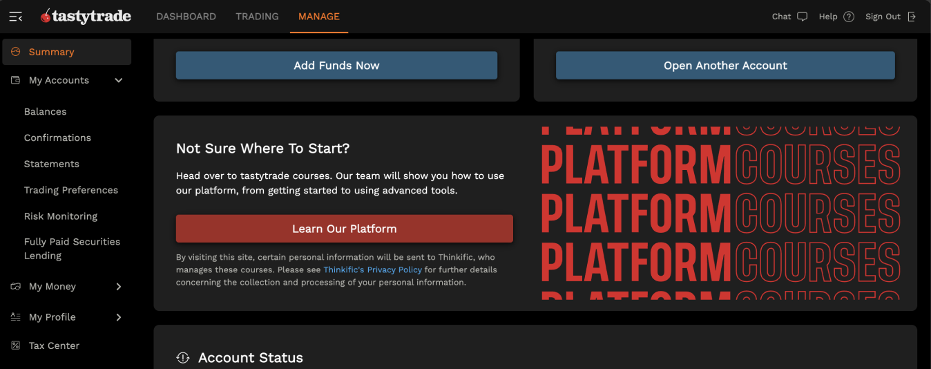
The application redesign opened a new problem. Users were opening accounts, but not funding their accounts or engaging with the platform. After obtaining user interviews and feedback, we learned the common issue was that Tastytrade was an advanced platform that scared new users, especially those who hadn’t traded before. The solution was an in-depth tutorial site that taught newbies how to trade.
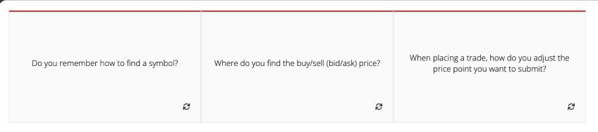
Trading school is in session
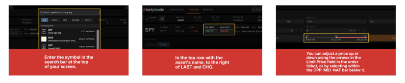
Collaborating with Tastytrade’s expert Trade Desk, I helped craft detailed lesson plans around the basics of trading, along with more advanced tricks, too. The courses included glossaries, interactive flashcards, and video how-to’s hosted by real traders. These tutorials helped new traders build their confidence, walking them step-by-step through the platform’s many advanced features.
Additionally, I worked with the CRM team to develop email journeys that encourage and congratulated users for completing courses.
Results
By putting their best foot forward, Tastytrade increased applications and new user engagment.
The new application redesign saw an immediate impact in user experience, with many more users completing their applications. And they finished in faster time, too, which demonstrates that by showing a little content at a time, you can get users to complete things faster. Additionally, the new tutorial courses gave new users a boost of confidence, resulting in higher funding and engagement with the platform.
This project demonstrated that by giving users clear instructions and the content they need up front, they’ll feel empowered to use new platforms.
54% increase in new accounts year-over-year.
5 min reduction in application completion time, down from 15 minutes to 10 minutes.
3% increase in completed applications just from an initial change to Trusted Contact copy.
65% of users joined Tastytrade courses in their first month.
20% of users who enrolled in a course had a 20% higher open-to-fund rate.
5% of users who enrolled in a course had a 5% higher open-to-trade rate.