First-Time User Onboarding
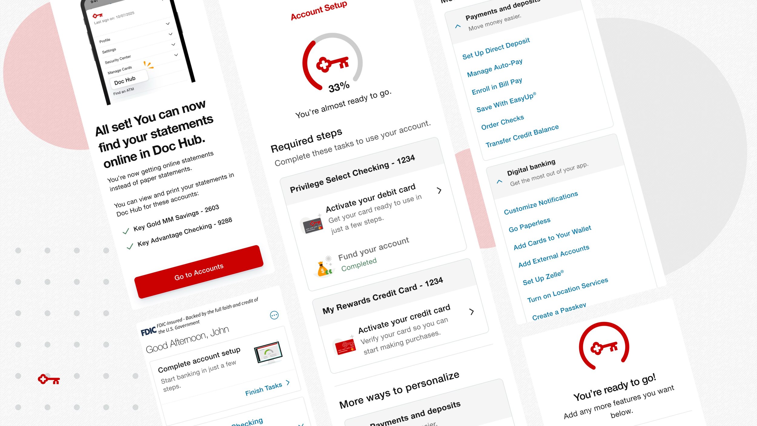
KeyBank had a disconnected first-time user experience. It wasn’t clear which tasks needed to get done first, and key settings were buried under multiple menus.
But by redesigning the onboarding content, we were able to create a more intuitive experience that both helped new clients get started with their bank accounts and saved the business money, by enrolling over 300k new users in paperless statements, saving over $3 million a year in printing and shipping costs.
Role
Senior UX Writer
Collaborators
Pauline Thach, Lead Product Designer (Portfolio)
Background
KeyBank wasn’t making a good first impression.
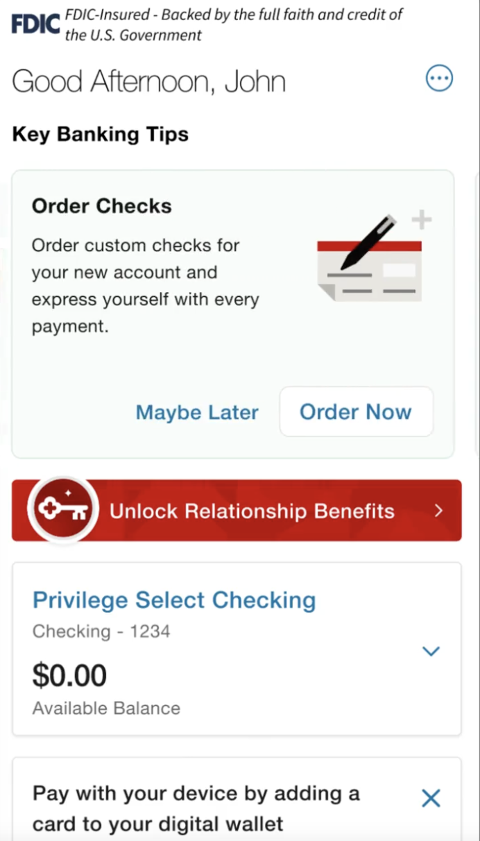
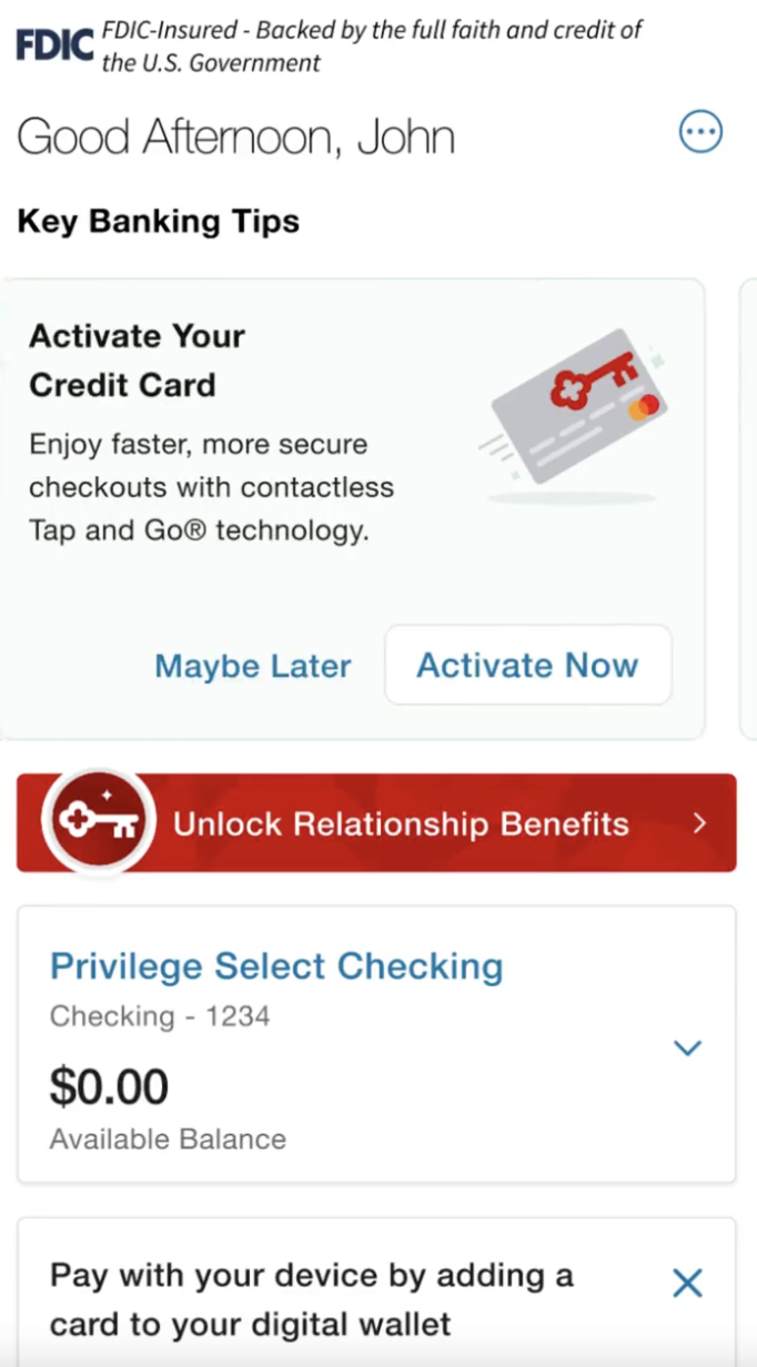
When you opened an account, your onboarding tasks were listed individually in a horizontal carousel on the Account Summary page, where they competed for attention with promotional content and everyday banking activities.
There was no way to track your progress, and to further confuse things, completed tasks stayed visible and important features like online statements required manual enrollment.
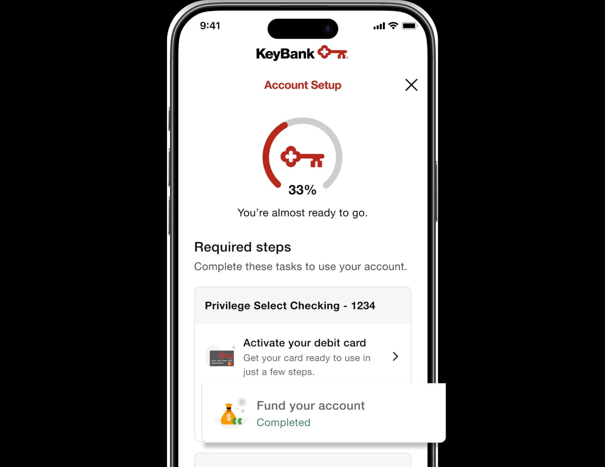
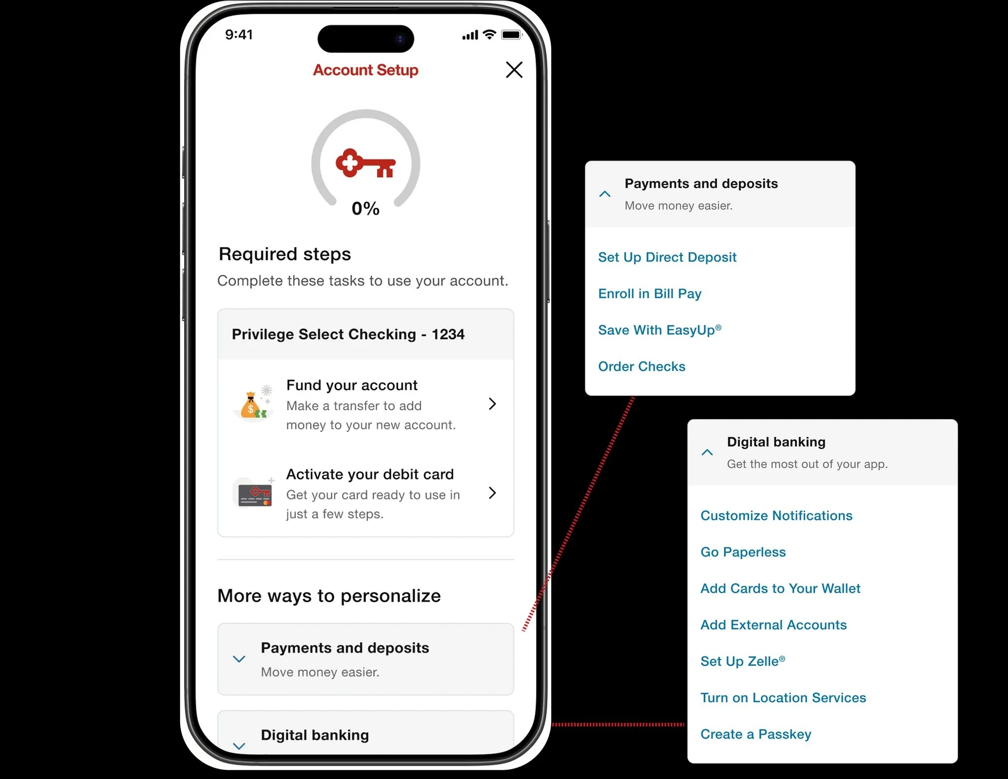
By using a hierarchy of information, users could track their setup progress.
First, there would be a progress tracker at the top of the screen, showing a user how many mandatory tasks they had completed. We emphasized mandatory tasks with an icon, subhead, and a description, giving them more real estate and information to emphasize their importance.
Below that, we placed a list of elective tasks, like adding cards to your digital wallet. A user could skip these — but they were easily accessible if they needed them.
The Opportunity
Clearer content design could guide users through their onboarding journey more efficiently.
This would start with a clear home for onboarding tasks. Instead of spreading them out over a carousel, where they competed with offers and account tiles, we created a single card at the top of the Account Summary page that linked to an Onboarding Page, where a user could clearly see all the tasks they needed to accomplish.
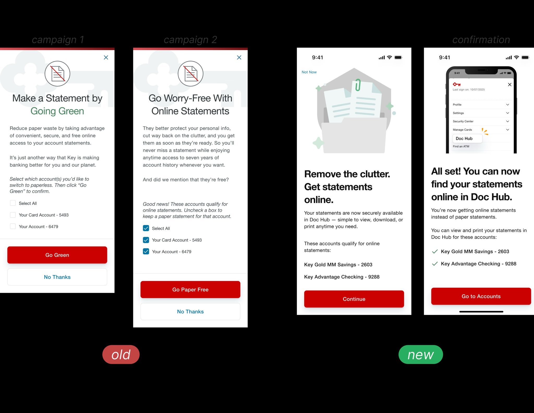
Finally, we reduced the user’s workload by removing unnecessary steps.
Originally, users needed to select individual accounts to sign up for online statements. That meant a lot of checkboxes and a lot of clicks. But we reduced it to one single, catch-all click, allowing users to enroll all of their accounts in paperless billing at once. I also added some extra language reducing clutter, to give users another tangible benefit. Users could still refine their preferences in their settings, but this gave the majority of users a seamless way to set up their online statements.
Results
KeyBank started building great relationships with users right from the get-go.
With a clear onboarding task list, users were able to get the most out of their account. Online statement enrollment surged in the first 30 days, making an immediate impact on the business’s costs by saving about $10 per client in printing and shipping costs.. Additionally, users increased engagement in non-mandatory tasks like direct deposit and digital wallets, thanks to more intuitive experience.
This project showed how organizing information with the user’s needs in mind doesn’t just create a smooth user experience, it demonstrably affects a business’s bottomline.
300,000+ accounts enrolled in online statements in 30 days.
<1% un-enrollment rate.
$3 million saved in yearly printing and shipping costs.
85% of users who saw the onboarding experience completed all of their required tasks.
15% increase in direct deposit enrollment.
37% increase in digital wallet enrollment.